Form Filling
A simple idea I learned at Josh Phegan’s Boardroom event in Melbourne is to fill out your own forms.
Take every form you have, be it printed or online and complete them as if you’re the customer. And then ask yourself, “how did that make me feel?”
I watched as several business owners squirmed as they completed the exercise realising:
1. How unnecessarily complex their forms are
2. How unfriendly their forms are
3. How much information they ask for that is irrelevant, typically information that won’t be acted on
Ideally a form should be as simple as possible. If all you need is a name and an email then that’s all you should ask for – you can get the phone numbers, postal address, shoe size, etc., once the customer is engaged… start simple and build.
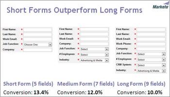
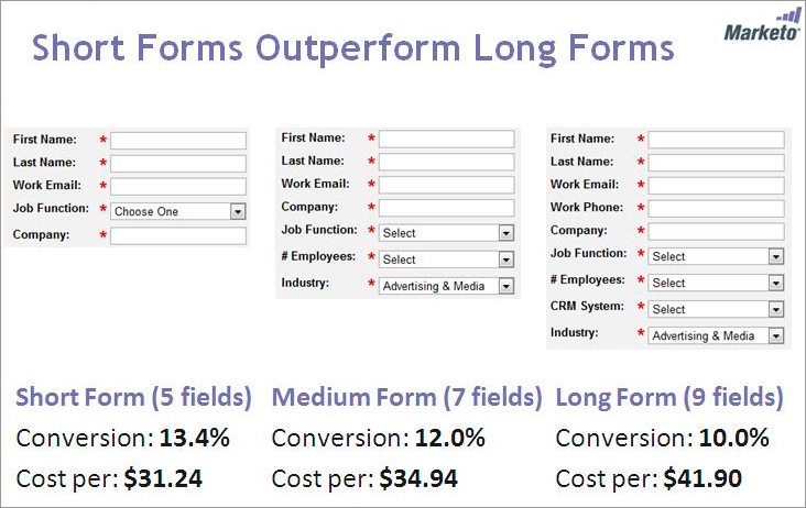
The dividend is not only a better customer experience but the increased likelihood of capturing more customers – according to CRM experts Hubspot, the average time people will take deciding whether to complete an online form or not is 6 seconds – that’s not to say you can’t ask for more information than would be captured in this time but for every second extra you reduce the likelihood of completion. This view is confirmed by research carried out by another CRM business Marketo – as illustrated above.
Think about your own experience, how often have you said to yourself “I can’t be bothered with all this” or similar? Einstein is alleged to have said, “make it as simple as possible…but no more so” – and I suggest that’s an excellent mantra when designing forms.


